Naughty Dog UI Test
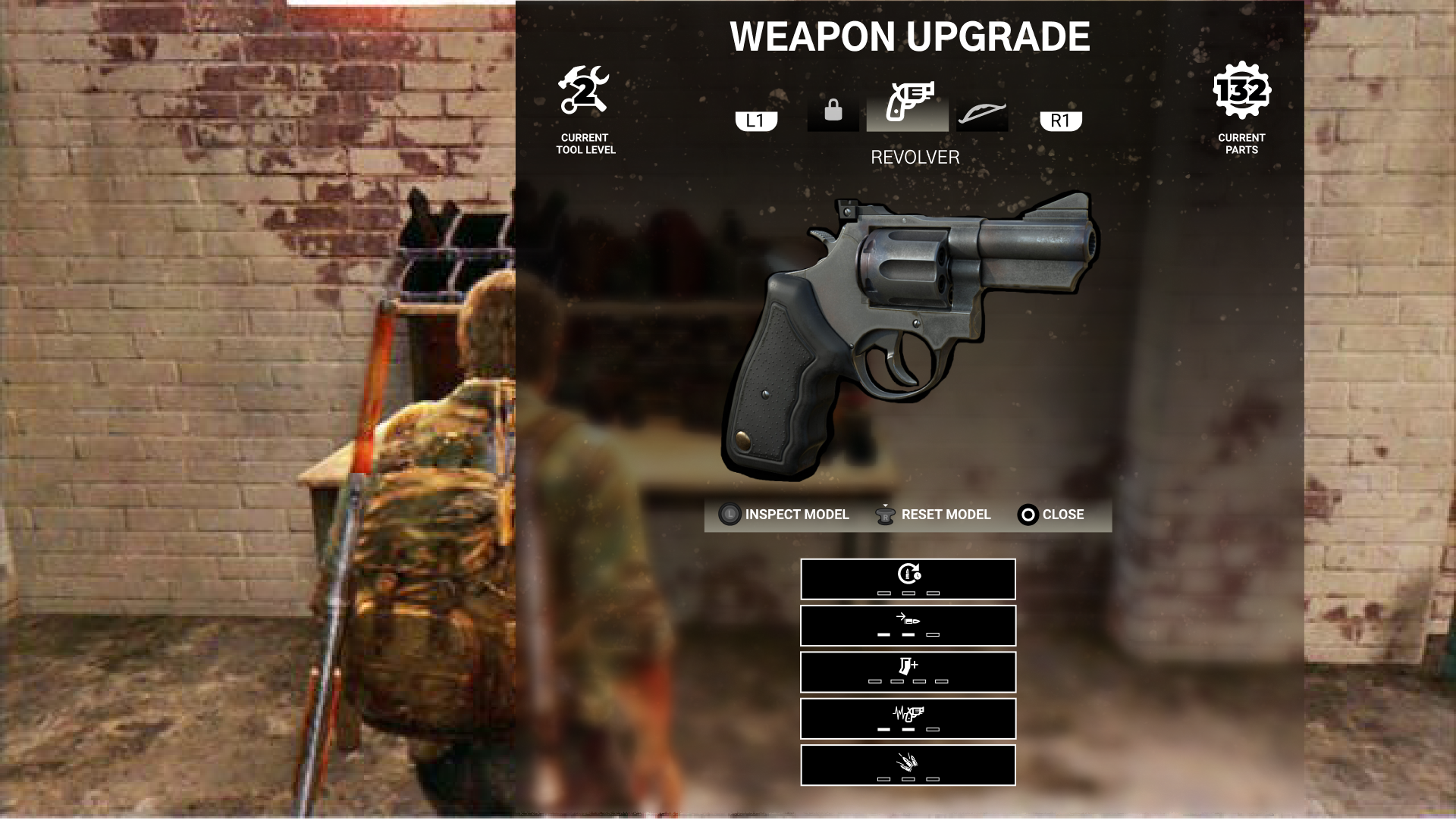
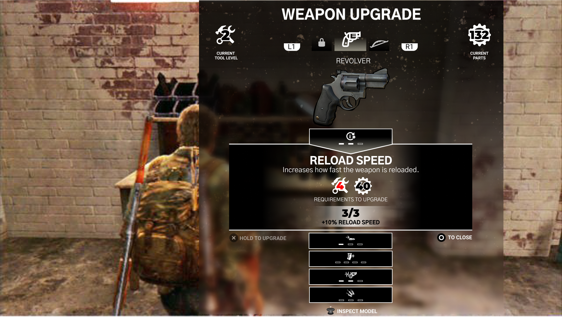
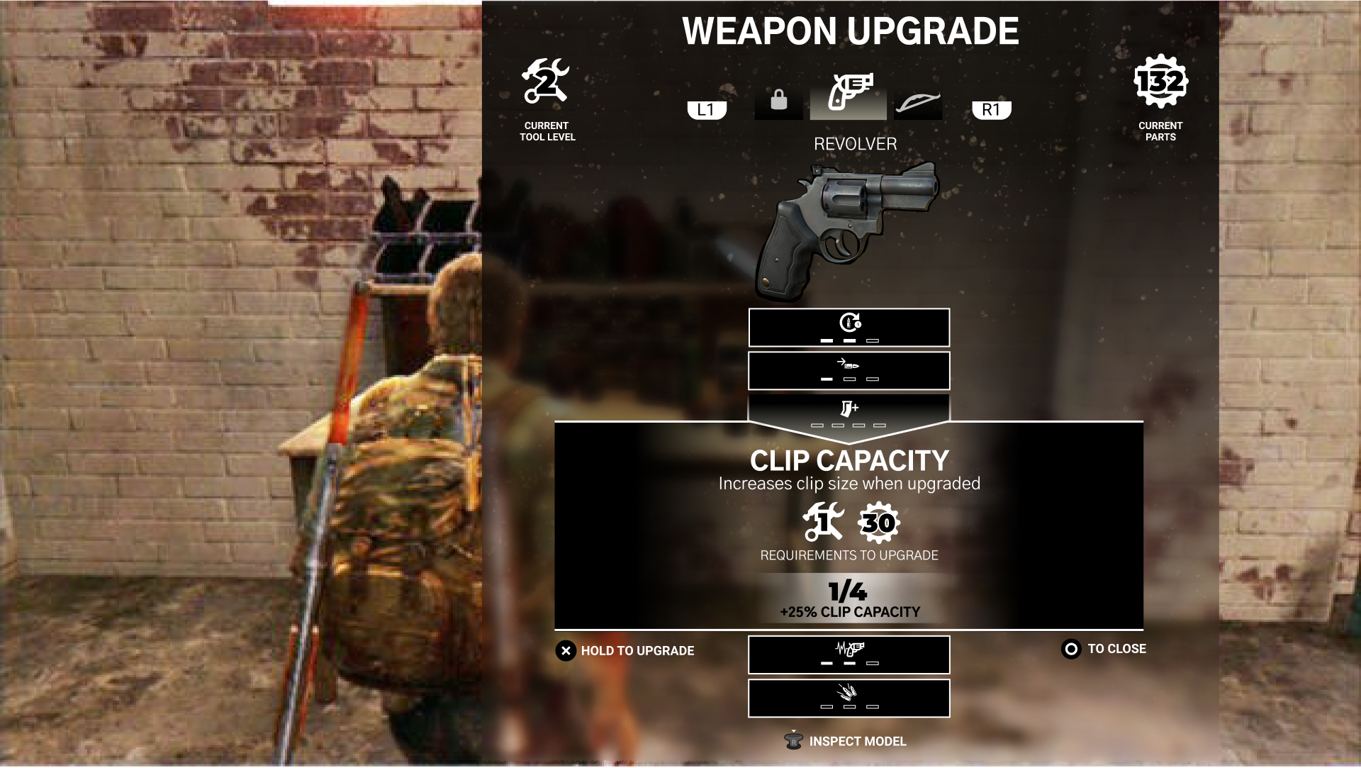
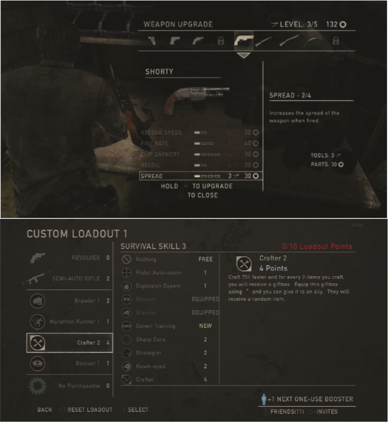
This was an art test given to me by Naughty Dog. The task was to redesign the weapon upgrade screen and the multiplayer loadout screens. The only original design element I kept was the bars showing how many upgrades you had left, but instead of nested in the menu with several other containers of information everything is now centered and all information is contained within this accordian style menu, with top level information for at-a-glance review of your upgrades. I wanted clear and consistent knowledge of your tool level and how many parts you have which i feel was a large upgrade to the old design. and reduce to only showing those in 1 area rather than 2.
Weapon Upgrade:
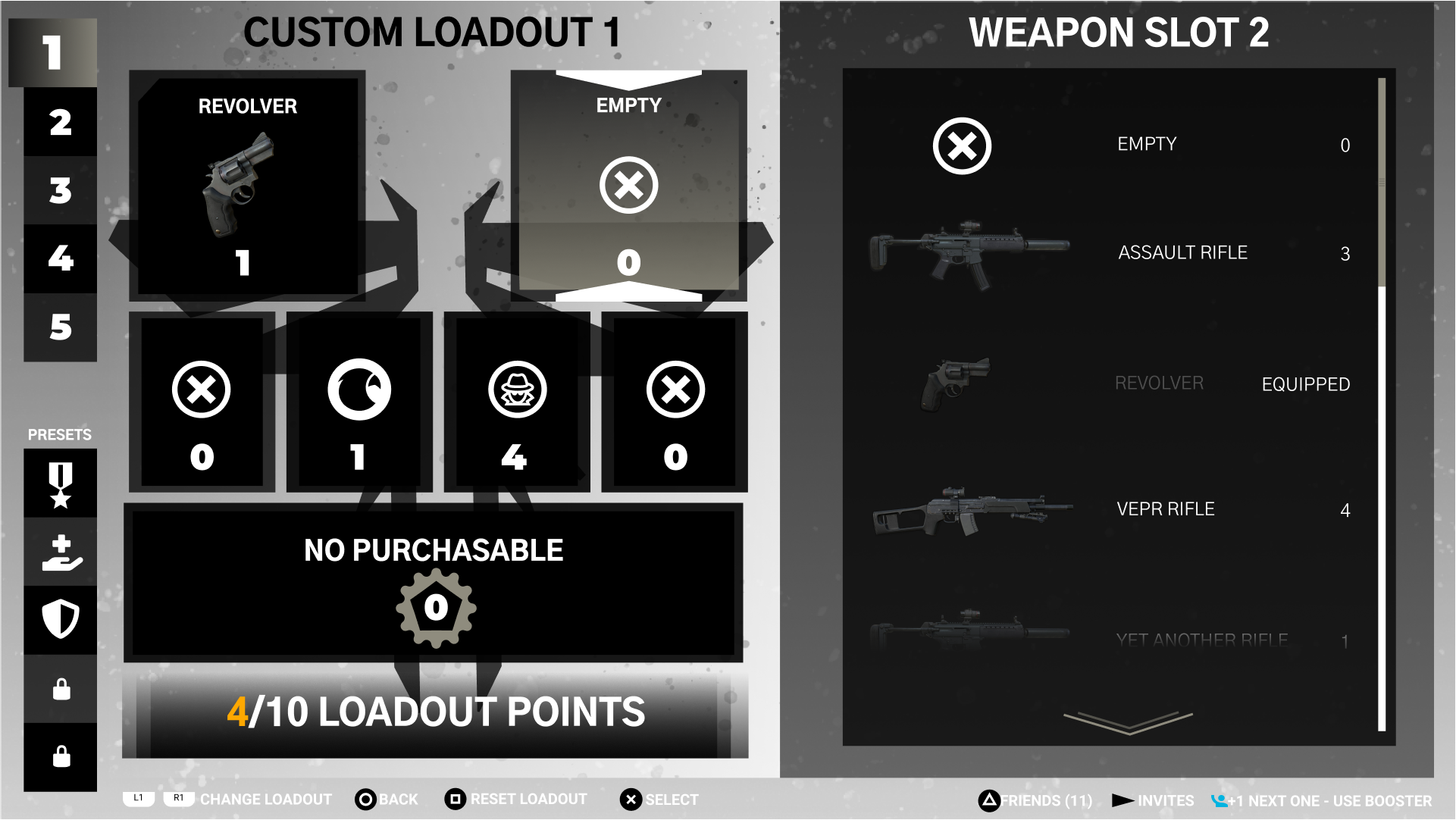
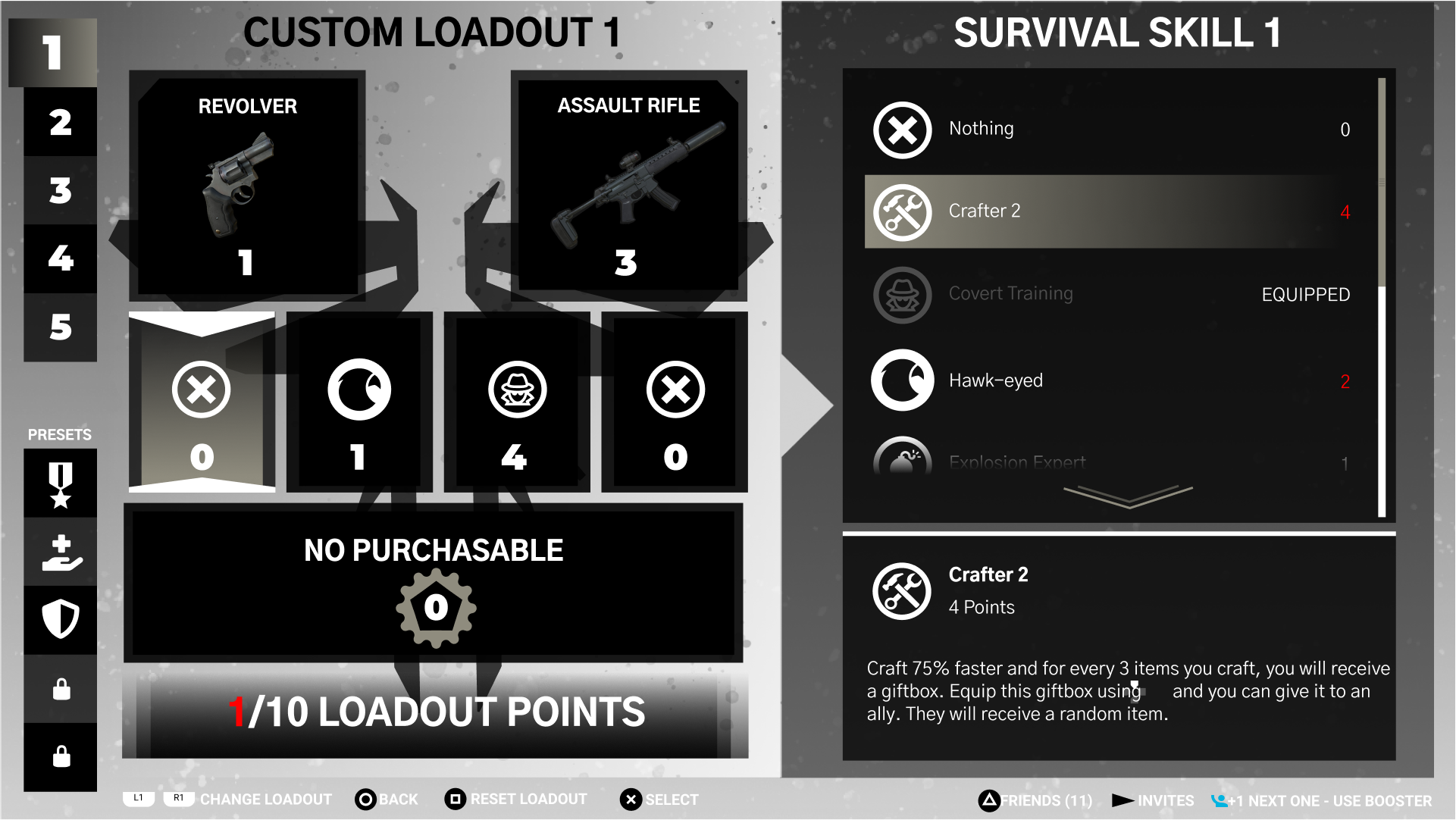
For the loadout I implemented a custom and preset category, gave current chosen faction identity to the screen, reduced the amount of content to 2 vertical stacks. Loadout/Loadoutpoints on the left, Choice details on the right
Loadout:
While i was not chosen i was proud of this design and wanted to share.
Also Here is what the old screens looked like for reference:
Another Project
Illustration: X-Wing